The Words Beneath the Words: Seven Nights of Leaving the Captions On
Photo: Pittigrilli, CC BY-SA 4.0, via Wikimedia Commons
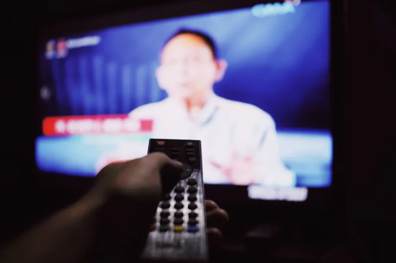
The remote control has a button I have pressed maybe four times in my life, and always by accident. Captions. Subtitles. The little rectangular speech bubble icon that appears on every streaming menu and almost never gets chosen in my house. Last week I chose it. Then I chose it again the next night, and the night after that, until seven evenings had gone by and I had watched everything — a network sitcom, a two-and-a-half-hour drama, an old black-and-white thing on a cable channel, a baseball documentary — with the words running along the bottom of the screen.
I expected to be annoyed. I was not annoyed. I was, instead, gently rearranged.
The Default Nobody Picked
Here is the strange part: captions are on by default for a huge number of American households now, and most people who have them on did not turn them on. They came that way, or a roommate left them, or a firmware update nudged a setting. It is one of the quietest design decisions in modern entertainment — a layer of typography sitting on top of every show, and almost nobody talks about it as design at all.
So I treated it like one. Seven nights, one question: what does the text actually do to the room?
Night One: The Sitcom Moves Faster Than I Remembered
I started easy — a half-hour comedy, the kind with a laugh track and a kitchen set. Within four minutes I understood something I had never quite clocked: the jokes are stacked closer together than the ear can track. Captions made the density visible. A line would land, then a tag, then a second tag, all inside fifteen seconds.
And the punchlines arrived in my head a half-beat early. I would read the joke, then hear it, then laugh at a small delay, like an echo. It was not unpleasant. It was like hearing a song with the lyrics printed beside it — you notice the rhymes more, and the melody a little less.
I also noticed how much of the comedy was in the interruptions. The captioner had typed dashes and ellipses, and the overlaps were suddenly legible. Two people talking over each other reads as a mess on the page. On screen, with the words underneath, it reads as a rhythm.
Night Two: The Typography of a Scene
Once I was looking, I could not stop looking. Every service sets its captions differently. One uses a heavy sans-serif with a firm black outline; another floats a slightly condensed face with a shadow so soft you barely notice it until the background turns white. A third lets you pick the font size and color and background, which sounds generous and mostly results in a box so opaque it looks like a bug on the screen.
The old movie on cable was the best of the lot. Sparse, unobtrusive, placed low, gone the instant the line ended. Someone had made a hundred small decisions about that text, and all of them were in service of getting out of the way.
That is the whole job, really. A good caption track is a piece of invisible design. The moment you admire it, it has probably failed slightly.
Night Three: Everything Starts Making Noise
Here is the thing nobody tells you about captions: they credit the room. Not just the dialogue — everything.
[refrigerator hums]
[distant dog barking]
[keys jangle]
I had watched this show for three seasons and never once registered that a refrigerator was humming in the kitchen scenes. It was there. It had always been there. The sound designer put it there on purpose, and I had let it slide right past me for years, the way you stop hearing your own air conditioner.
By midweek I was watching with a different kind of attention — not on the plot, but on the mix. Captions turned a passive listen into an active one. They were, weirdly, a sound-design delivery system.
The Bracketed Silence
The most interesting captions were the ones that described nothing happening.
[silence]
[no audio]
Or, better, no text at all — a stretch of screen where the dialogue stopped and the captioner simply let the frame sit. That absence is deliberate. Somebody watched the scene, decided the quiet was the point, and chose not to fill it.
I started waiting for those gaps. In a tense scene, the bracketed beat where two characters just look at each other became the most interesting thing on the screen — not because of what was said, but because of the small editorial decision not to say anything at all.
Night Five: Reading Ahead Is Its Own Spoiler
The slow drama was the hard one. Two and a half hours, lots of long looks, dialogue that arrives like weather. With captions on, I finished every line before the actor did. My eyes were always a few words downstream of my ears.
That is the real trade. Text gives you comprehension and takes away surprise. You cannot be ambushed by a line you have already read. Some movies can absorb that — dense, talky, plotty ones, the kind where a missed name matters. Others live entirely on timing, and timing is exactly what the captions spend.
I would not watch a quiet, patient film with captions on again. But I would watch a fast one that way forever.
Night Seven: A Rule Instead of a Habit
By the end of the week I had stopped thinking of captions as an accessibility feature and started thinking of them as a lens you can screw onto the television — one that sharpens some things and softens others.
So I kept a rule rather than a habit. Dialogue-heavy shows, complicated plots, anything with accents or overlapping talk or a mix that buries the voices: captions on. Movies that live on faces and pacing and the sound of an empty house: captions off, and let the refrigerator hum.
The button is still there on the remote. I no longer press it by accident. I press it on purpose now, which is a small thing, but it turns out a lot of television is built out of small things — and now I can read them.