The Handshake Before the Scene: Reading a Show's First Ten Seconds
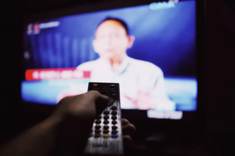
There is a moment, right after you press play and right before anything happens, when a show introduces itself. Not the pilot, not the premise — the ten seconds. A wordmark resolving out of black. Three notes of a theme. A single card that says the name of the thing you are about to watch.
Most nights we let it slide by. We're reaching for a drink, or skipping ahead, or already half-reading a phone. Which is a shame, because that little stretch of screen time is doing more work than almost any other ten seconds in the episode. It's a handshake, and handshakes are informative.
So I ran a small experiment over a few weeks. Ten seconds on a kitchen timer, phone face down, no skipping. Ten seconds, then stop. Here's what those seconds turned out to be worth.
The Rules, Such As They Were
The setup was deliberately unglamorous. I'd queue up a series I already knew, hit play, and count to ten in my head while watching only the frame — no plot, no dialogue, no reactions to borrow. Then I'd write down four things: what I saw, what I heard, what the type looked like, and what mood I'd been handed.
Ten seconds is about two hundred and forty frames at standard speed. That's enough for a logo to breathe in, a camera to drift, a bass note to land. It's not enough for a scene. Which is exactly why it's interesting — the sequence has to say everything it's going to say before it has any story to lean on.
I leaned on a handful of titles I'd watched before, plus a few I hadn't, and I tried not to grade them. This isn't a ranking. It's closer to reading the label on a bottle before you open it.
Type Does the Talking First
Nearly every opening I sat with led with letterforms. That's the design decision you notice last and feel first.
The vocabulary is narrow and old, and it works. Wide letter-spacing so the title can hold a wide frame. A single accent color against near-black, because a full palette in ten seconds reads as noise. High-contrast serifs when the show wants to feel literary or expensive; condensed sans-serifs when it wants to feel like a headline. When a series sets its name in something soft and rounded, it's telling you the stakes are small on purpose.
What surprised me is how much of the mood arrived before the animation did. Glowing red against black with a synth swell underneath is a promise of dread, and you know it before a single character walks on. A bouncy, hand-drawn title with a whistled melody is a promise of harmlessness. Neither is subtle. Both are honest about the transaction.
Typography also does the hiding. A title sequence can advertise the genre and disguise the tone. Plenty of shows about sad people dress their opening in bright, cheerful graphics, and the gap between the type and the story is the whole point — you're being told that the sadness will be funny, or that the fun will curdle. Ten seconds is plenty of time to plant that gap.
The Skip Button Is a Design Critic
Here's the thing nobody in a writers' room says out loud: the opening has to survive a button.
Streaming made the title sequence a competitive format. There's a prompt on screen offering to remove it, arriving within the first few seconds, and every viewer is quietly voting. A sequence that can be skipped without loss is a sequence that has already been skipped. The ones that hold up tend to do one thing well rather than five things adequately — a strong idea, executed in a single gesture, timed to land just before the impatience does.
That constraint has pushed the form in two directions at once. Some shows go longer and more elaborate, treating the opening as a short film with its own credits and its own composer, occasionally changing it up per episode. Others go the other way and cut to a two-second card — a title, a stab of music, gone. Both are design positions. The elaborate version says: stay a while, this is part of the show. The quick card says: we know you're here for the story, so here it is.
I found I respected both, and got irritated only by the middle — the ninety-second montage that neither commits nor gets out of the way.
What Ten Seconds Cannot Tell You
A confession: watching only the opening is a slightly dishonest way to judge a show. Those seconds are built by people who already know the whole season, and they're often the most polished, most revised piece of design in the entire production. You are reading the dust jacket.
But dust jackets are a real craft, and they're worth reading on their own terms. The title card tells you who the show thinks it is. The gap between that claim and the actual episodes is one of the more reliable pleasures of watching television closely — a show that promises menace and delivers melancholy, or promises warmth and delivers something with teeth.
Ten seconds also can't tell you whether the writing holds. It can tell you whether anyone cared about the seams.
A Small Practice Worth Keeping
I don't want to make this sound like homework. There's no ritual to adopt, no journal to keep. The whole experiment cost me maybe four minutes across a week, and the return was a slightly better vocabulary for something I'd been looking at for years without seeing.
If you try it, the only rule that matters is the timer. Let the thing finish its sentence. Somewhere around the seventh second, most title sequences show you their one good idea — the move the designer was proudest of. The letter that slides a half-step out of line. The color that arrives a beat late. The frame that holds a fraction longer than comfortable.
Those are the moments when a show stops being a product and starts being somebody's work. Ten seconds is a small window. It's also, it turns out, enough to see through.