Coming Attractions, Table for Two: What a Menu Promises Before the Food Arrives
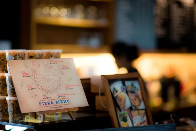
There's a quiet moment right after you sit down, before the water arrives, when the meal has technically already started. The menu lands in front of you. Nothing has been cooked, nothing has been tasted, and yet the evening has begun to take a shape.
That's not accidental. A menu is a piece of design quietly doing narrative work — pitching a version of the night before you've ordered it. It has a cast, a pace, a mood, and a few scenes it would very much like you to remember. In other words, it's a trailer. And like any good trailer, the best ones are selling you a feeling, not just a list of ingredients.
Before the First Frame: Paper, Weight, Type
Start with the object itself. A steakhouse menu on heavy cardstock with a serif so old it looks like it has a mortgage. A neighborhood taco spot with one laminated sheet, corners curling, hot sauce fingerprint near the bottom. A natural wine bar printing a new menu every morning on cheap stock, the ink slightly smudged from the printer's enthusiasm.
These aren't just production values. They're the opening credits. The weight of the paper is a budget signal — laminated means someone has planned for a spill, cloth-bound means a celebration is expected, and a chalkboard means trust the kitchen, not the printer. The typography tells you the genre before a single dish is named. All-caps sans-serif is a fast casual promise. A fussy italic suggests a chef with opinions about butter.
You haven't read a word of the food yet. You already know what kind of evening this is going to be.
Act One: Sequencing and the Slow Reveal
Menus are edited, and editing is where the story lives. The standard order — snacks, small plates, mains, sides, desserts — is a three-act structure with an unusually short runtime. Good menus curve your attention: a few things near the top to loosen you up, a middle stretch where the kitchen wants you to linger, and a finish that arrives just as you've decided you couldn't possibly.
Watch where things sit. The dish a restaurant is proudest of rarely hides at the bottom of a section. It's placed where the eye lands first, often with a little more white space around it — the trailer's money shot. The items crowded together at the margins are doing a different job, which is mostly to exist so the rest of the page has company.
The Voice-Over: How Descriptions Narrate
Here's where the menu gets talkative. "Fire-roasted." "Hand-cut." "Market vegetables." "Our grandmother's." Each of these is a tiny trailer beat, two or three words doing an enormous amount of atmospheric lifting.
Compare a listing that just says chicken with one that reads half chicken, lemon, thyme, cooked under a brick. The second one shows you a scene. You can hear the brick. You can almost smell the lemon. Neither description contains a single lie, but one of them has a director.
This isn't a criticism. It's craft, and it's often good craft. The trick is noticing when the language is doing the work of appetite for you — and whether, once the plate lands, the film matches the poster.
The Parts the Trailer Won't Show
Every menu has its ellipses. Prices often sit unaligned at the right margin, or omit the dollar sign, a small typographic softener that makes a number feel more like a suggestion than a transaction. A high-priced dish placed early in a section can make everything after it feel reasonable — the old decoy trick, borrowed straight from retail and applied to dinner.
None of this is sinister. It's just design, and design has preferences. The useful habit is simply to notice it happening, the way you notice a trailer cutting to black right before the good part.
The Experiment: Order From the Page You Skip
Here's something you can try this week, ideally at a restaurant you've been to more than once.
Before you order, identify the page — literal or figurative — that you always skip. Maybe it's the appetizers, because you never share. Maybe it's the salads, because you came here for something else. Maybe it's the vegetarian section, or the sides, or the single page at the back printed in a font nobody was consulted about.
Then order from it. Only from it, if you're feeling brave.
Pay attention to three things: the small resistance you feel before committing, the way the description shapes what you expect as the plate approaches, and whether the actual dish matches the little film your imagination already screened. Some people find they enjoy the surprise. Others find they miss their usual. Both are useful data.
The point isn't to be contrarian for its own sake. It's to catch the menu in the act of steering you — and to find out which parts of your appetite were yours all along.
After the Credits Roll
Memory gets edited too. A week later, you'll remember the dish that arrived with a story attached and forget the one that was merely fine. That's the menu's last trick, and honestly, its best one: it doesn't just sell you dinner. It decides which parts of the evening you'll still be talking about on the walk home.
Read the next menu slowly. Somebody wrote it like they meant it.